
Theme Switching using Local Variables (Beta)
Project type
End-to-end project design using the Design System & Figma Tokens to create light and
dark modes.
Contribution
Project Management
High-fidelity prototype
Library creation
My role
Product Designer
Duration
16 weeks
Outcome
Decreased time to build high-fidelity mock-ups
Accelerated the production of pages
Target Users
Product team and development team
Background
Figma Local Variables made its debut during Figma Config 2023, adding a new layer of flexibility and control to design systems. This represents a significant step towards more adaptable and user-centric design systems, by enabling designers to balance consistency with local flexibility. They unlock new possibilities for creating dynamic and responsive interfaces that cater to diverse needs and different contexts.
Challenge
Setting up and maintaining a robust token system with local variables is the main challenge, as it requires an advanced level of understanding token naming conventions, organization, and versioning is crucial. Also, integrating tokens into the design process requires a transition from static values to data-driven design.
Another big challenge involved the fact that Local Variables is a new feature, still in Beta mode, meaning that it has its limitations. They don't fully integrate with all design aspects, like blend modes or some text styles, requiring workarounds.
Opportunity
Combining Local Variables with design token creating presents not only exciting possibilities but also a seamless design system integration. Streamlining consistency and making global updates. Imagine changing a brand color, and all instances adjust automatically.
By using tokens as a design system is produced and developed, tokens eliminate repetitive value input, saving time and increasing consistency. It's also great for collaboration and scalability, as shared libraries with centralized tokens ensure teams to use same values across the board, making collaboration smooth and scalable. No more search hunts for "the orange button color.”
Local Variables enable a whole new horizon for the design process, making brand switching, or theme switching incredibly straight forward, as quick as a click of a button.
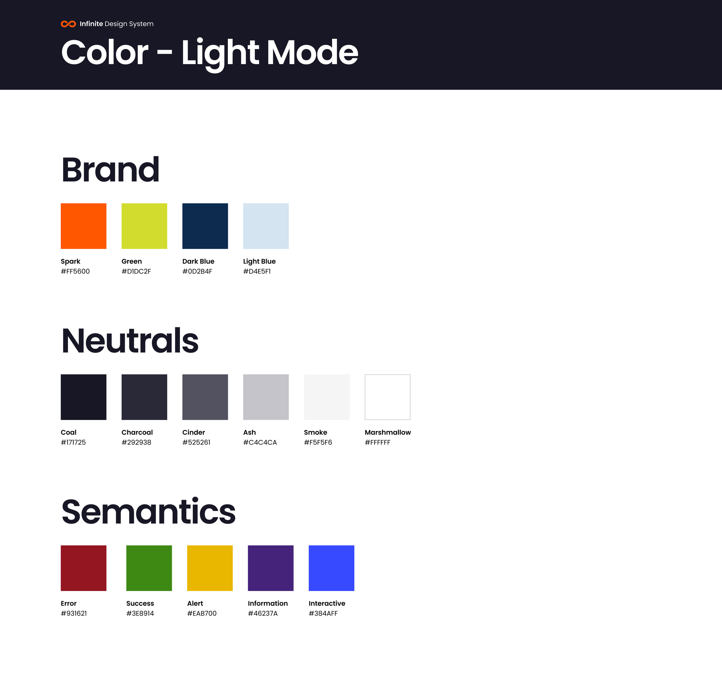
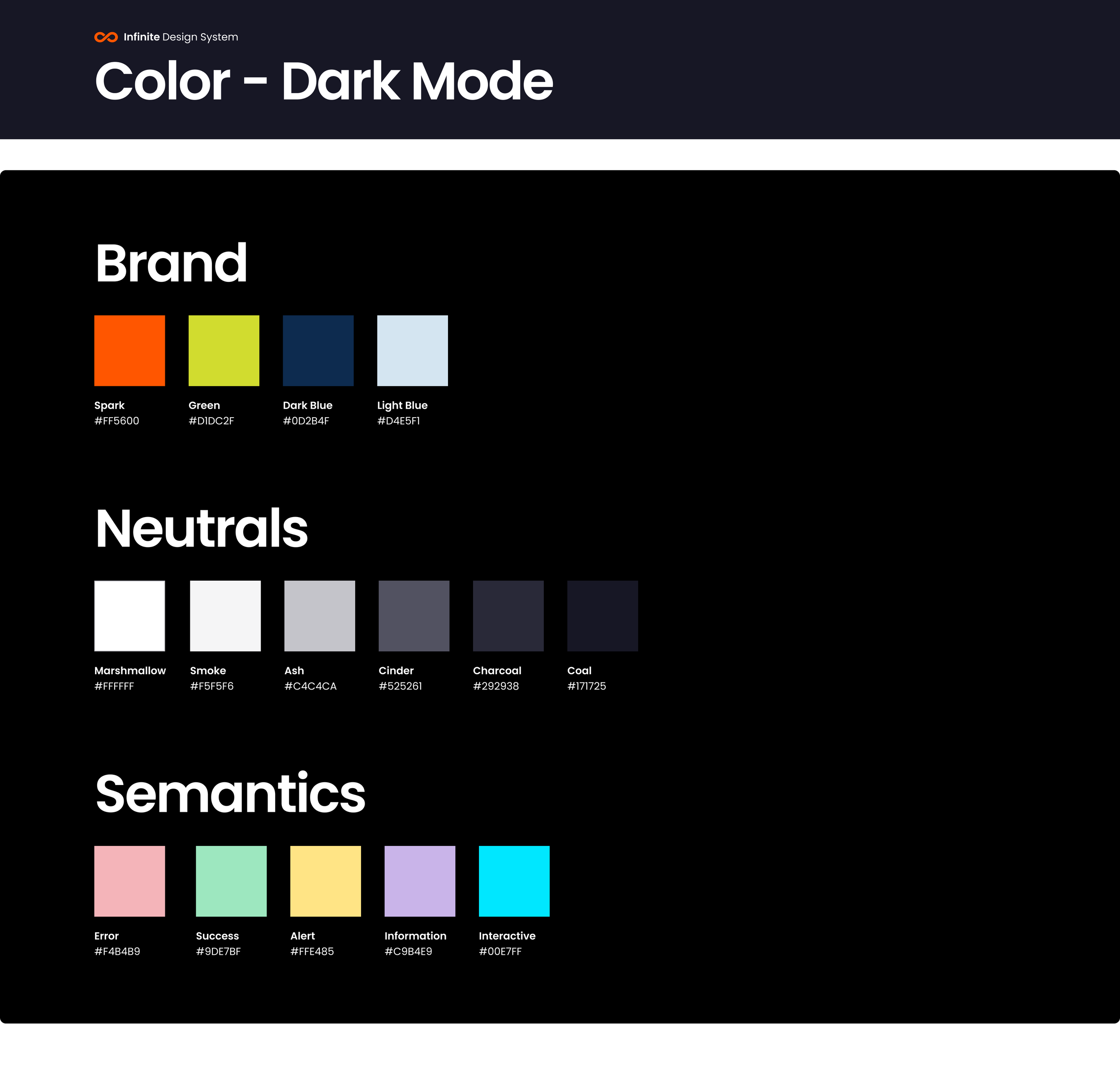
Primitives
In the context of Figma Tokens, "Primitives" refer to a specific category of variables that hold the most fundamental design values, such as:
Colors: These include all the base colors of your design system, like primaries, neutrals, and accents.
Typography: Variables for font families, sizes, weights, and line heights.
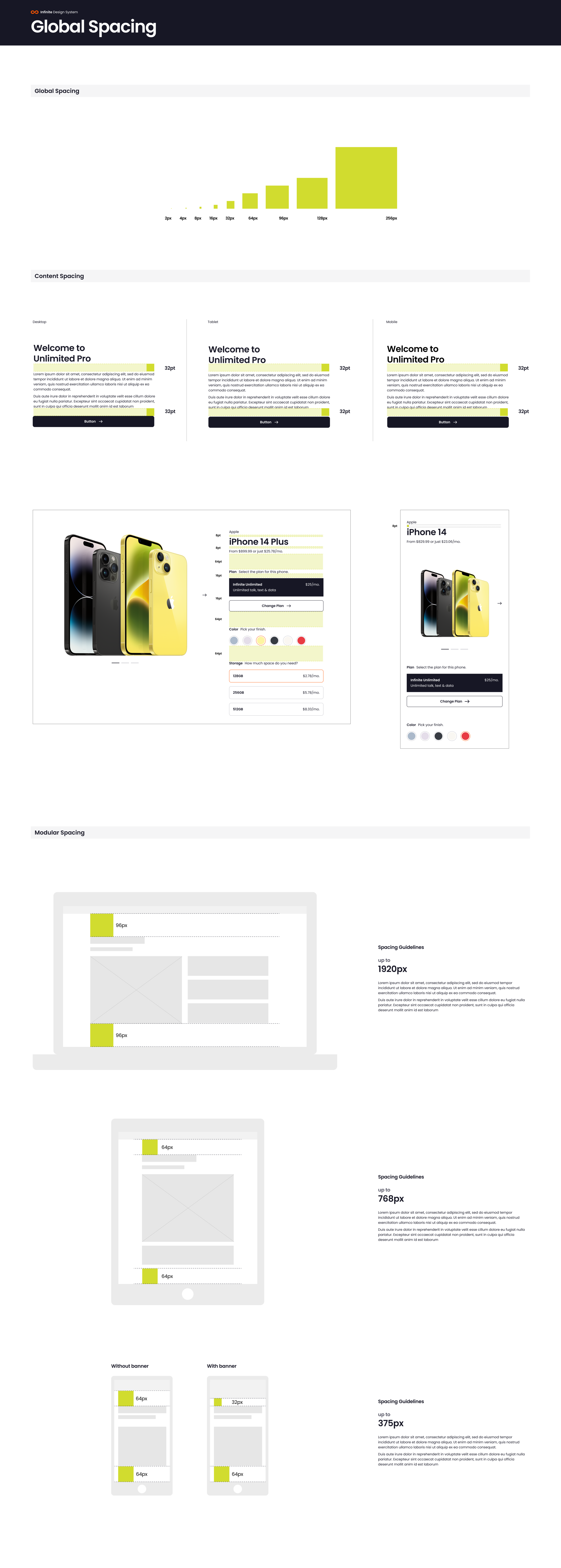
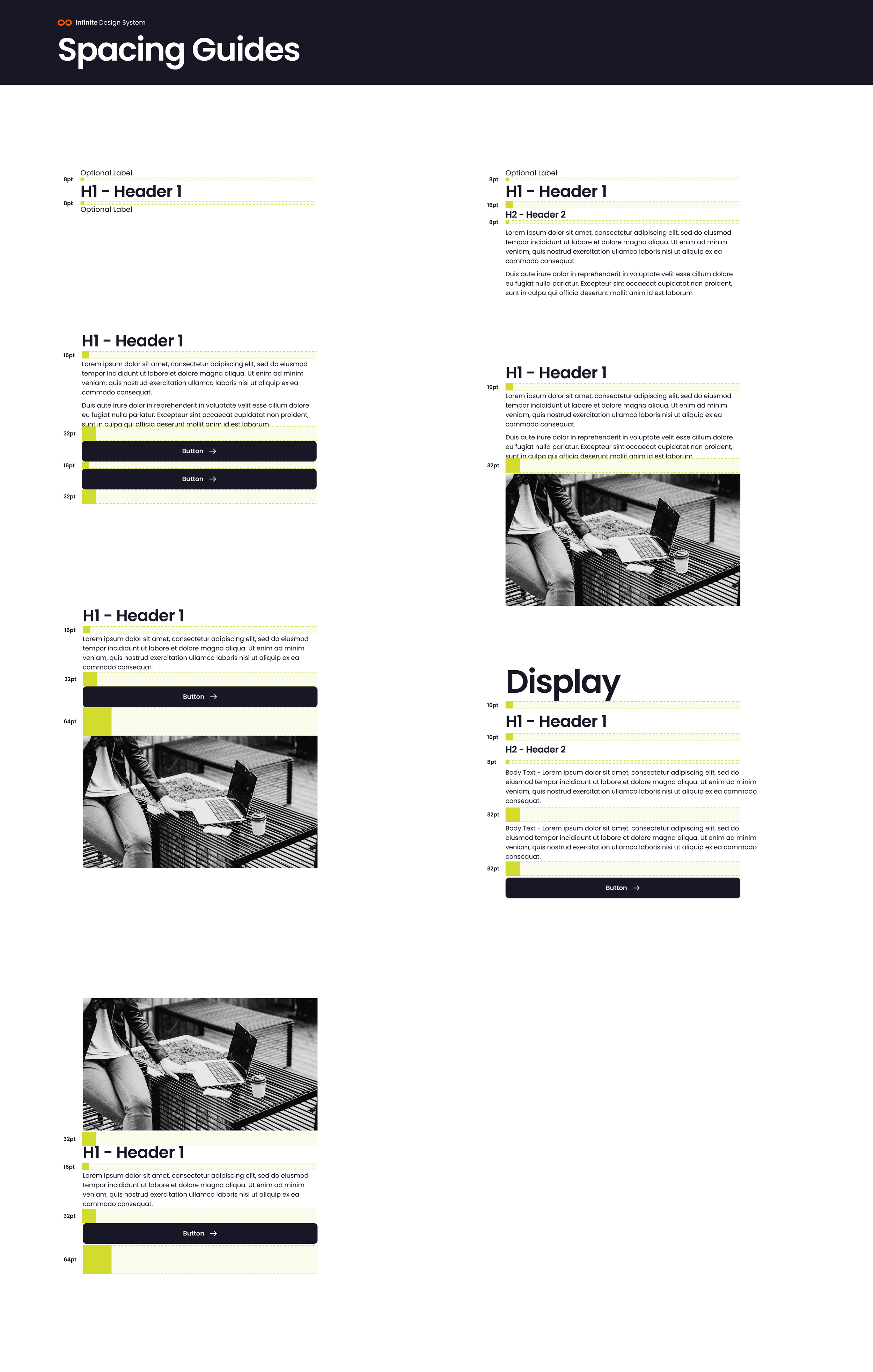
Spacing: Values for padding, margin, and other spacing properties.
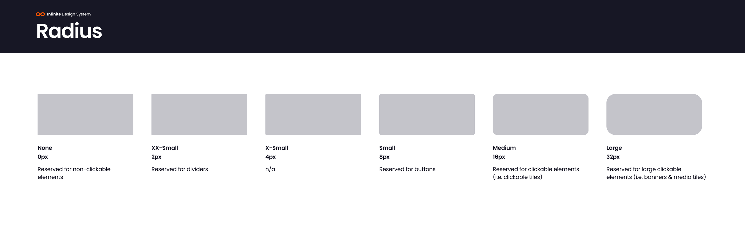
Radius: Define the corner radius of elements.
Essentially, Primitives are the building blocks of your design system in Figma. They hold the raw, unstyled values that will be used to create more complex design elements like buttons, layouts, and components.
Colors
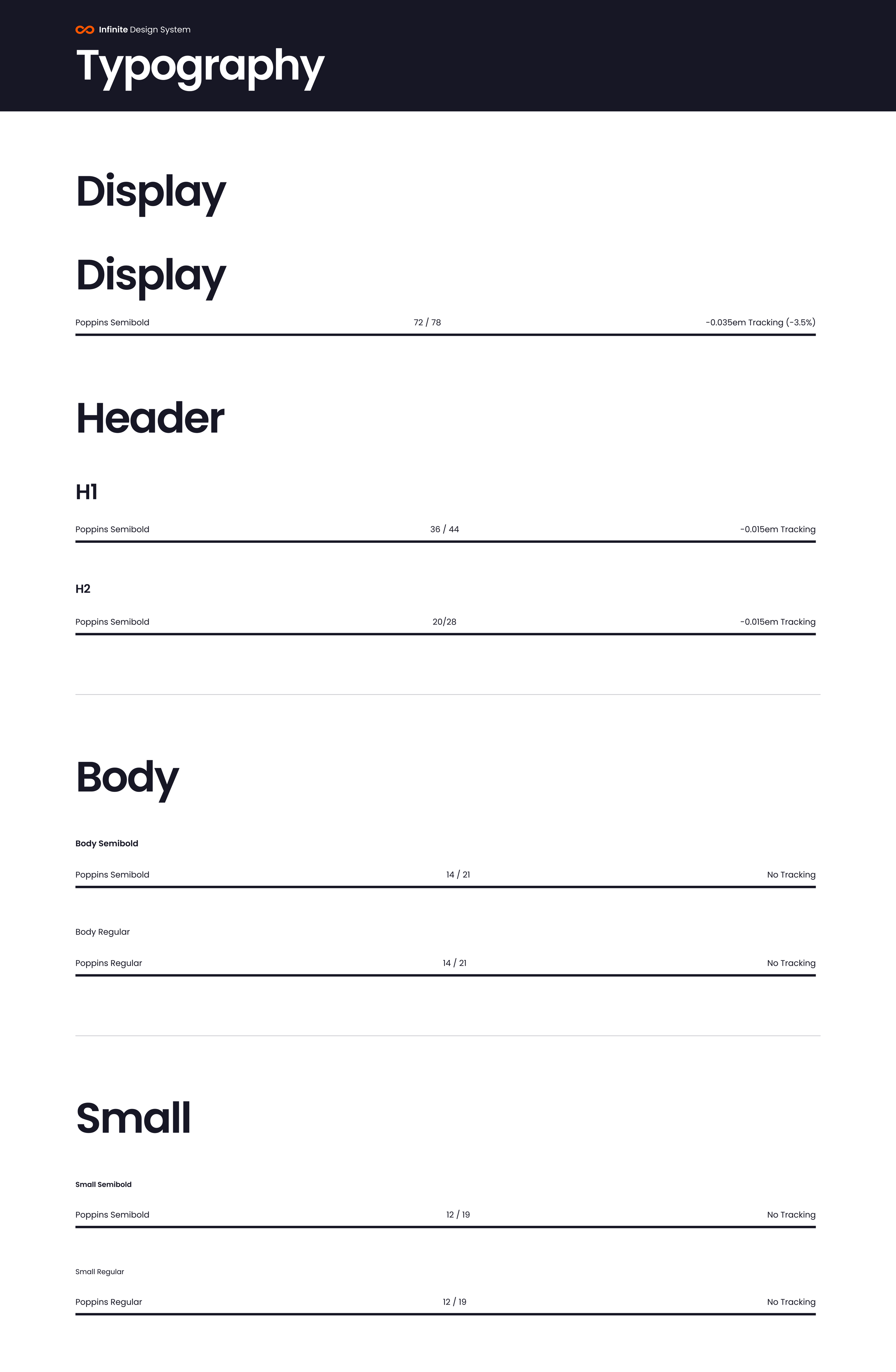
Typography
Spacing
Radius
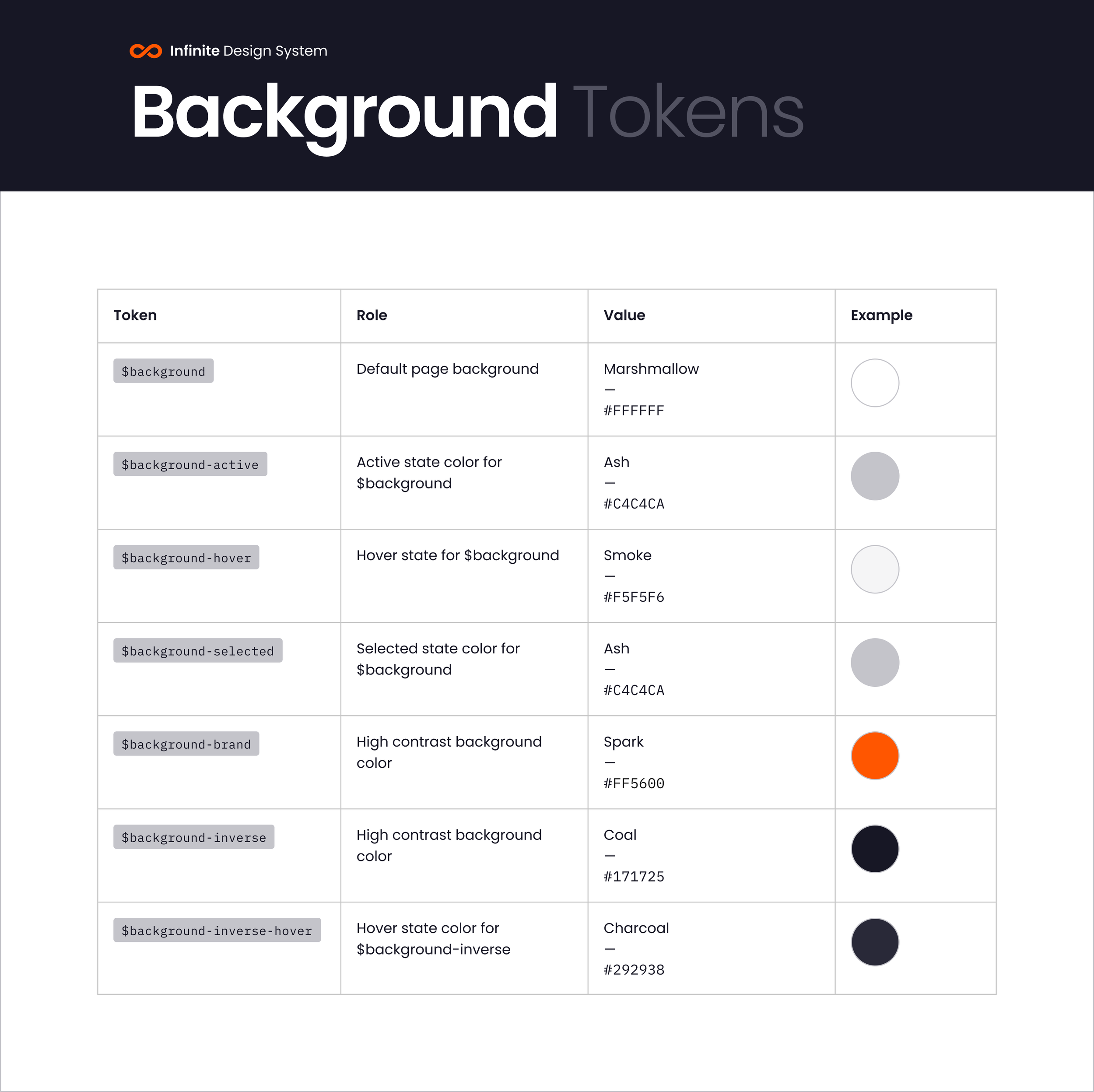
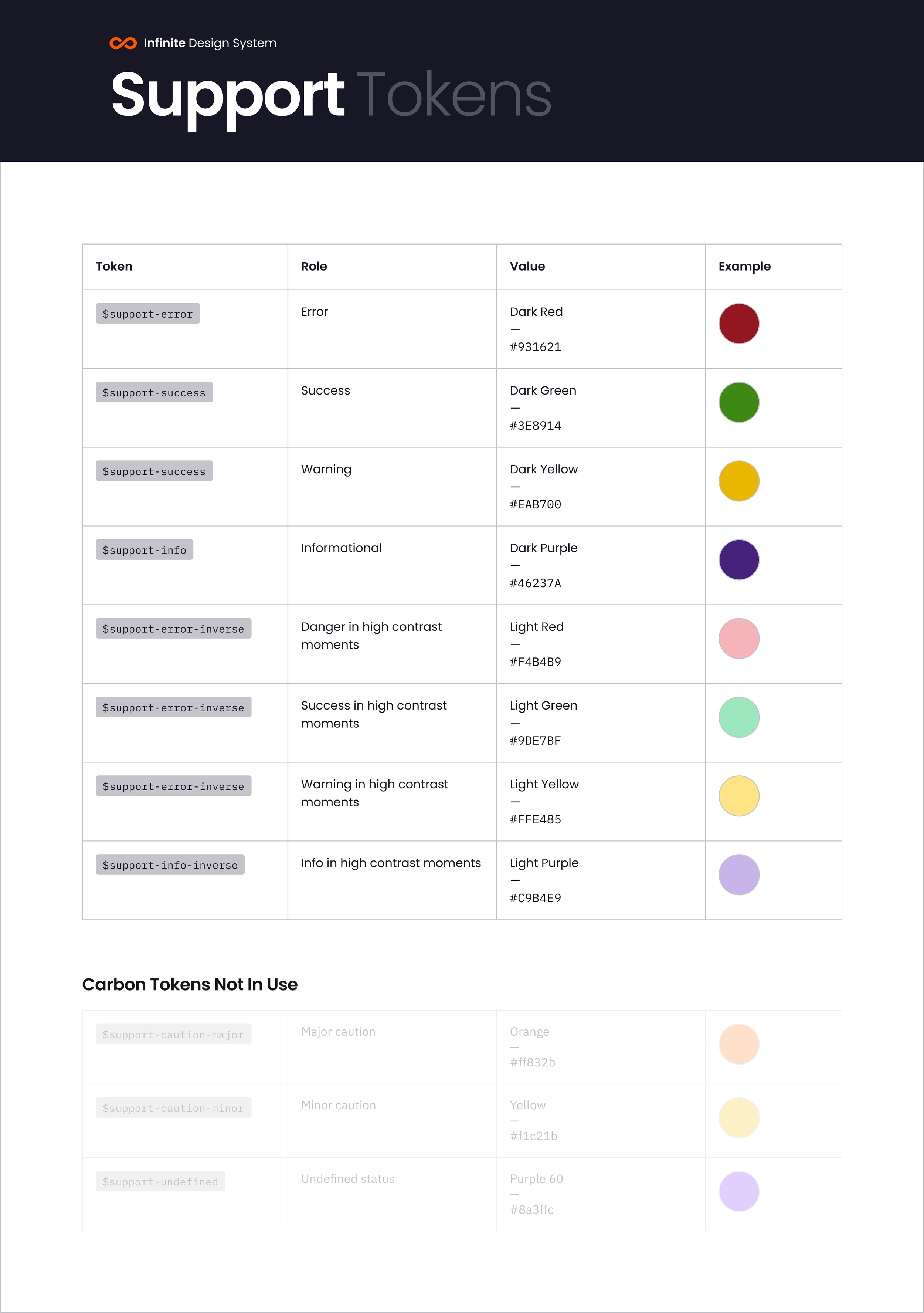
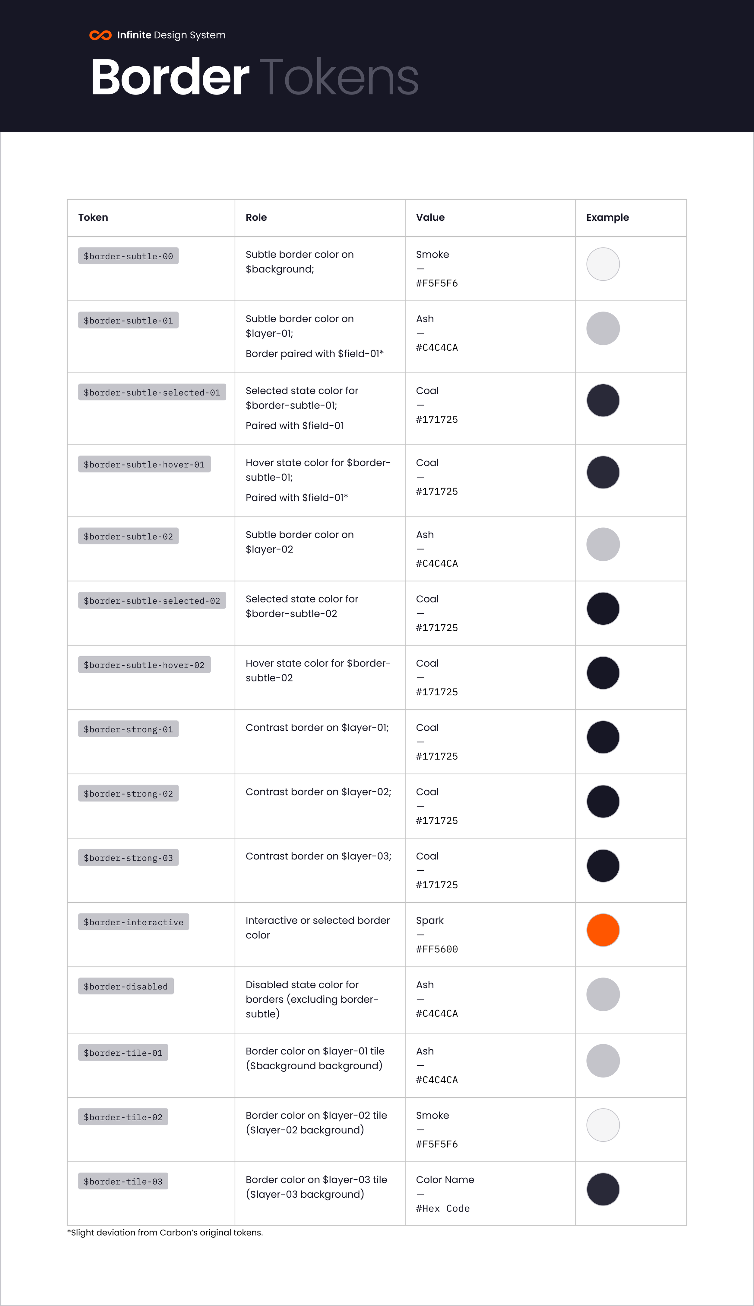
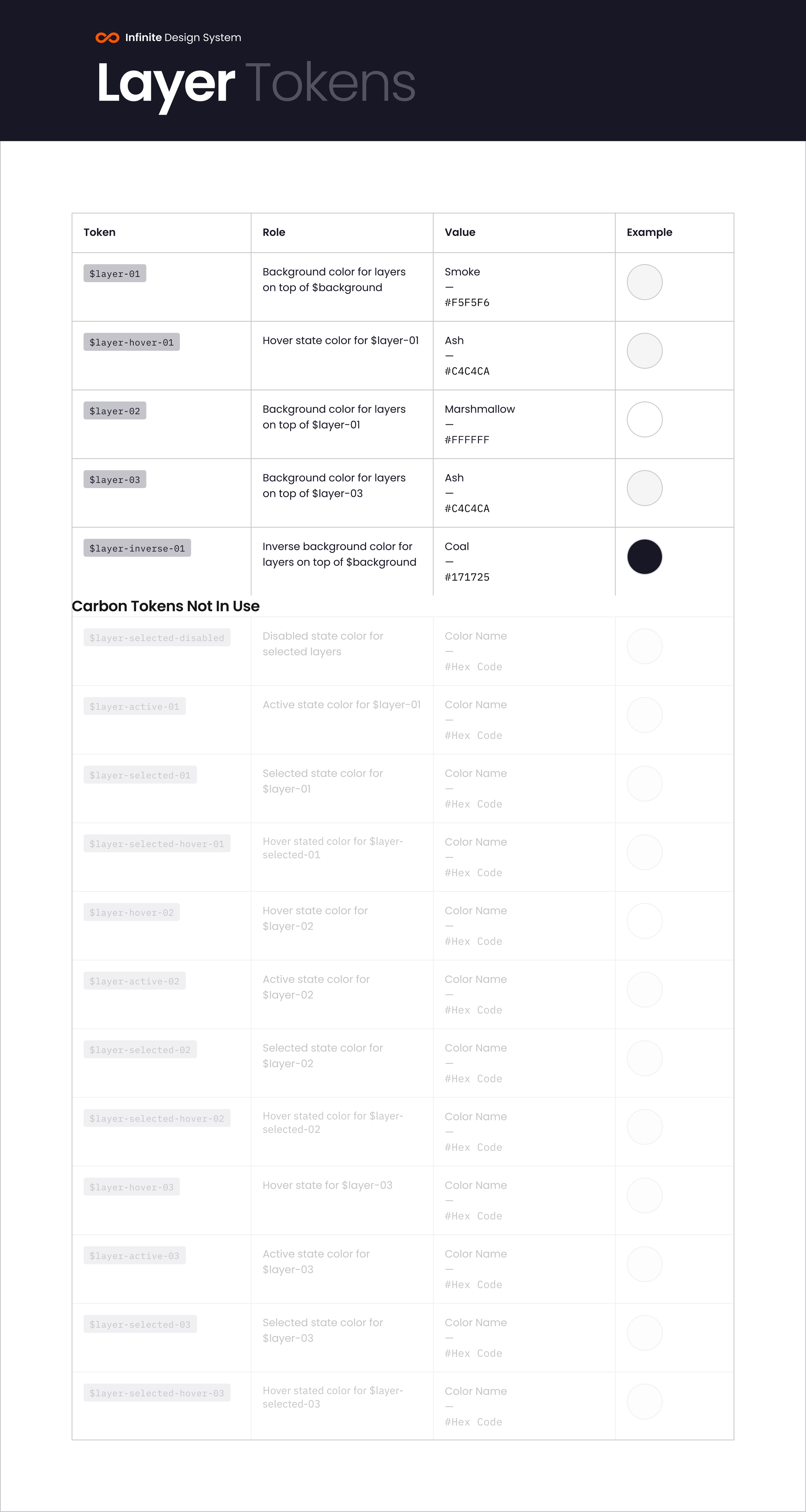
Design Tokens
Design Tokens are named, reusable elements that store design properties, like colors, typography, spacing and others. They act like building blocks for a design system, ensuring consistency and efficiency. Create tokens by adding a descriptive name and assigning its corresponding value, for example, hex code for color, font family for typography, pixel value for spacing, etc.
In the process of creating tokens, we based our system on Carbon by IBM. Carbon offered a good amount of preset Tokens that made it easier to adapt our system into. But, by using Carbon, we also had to adapt and add new tokens, as we wanted a very catered design system that feels original and unique to the Infinite brand, while creating a system that supports our team and the distinctive features we needed, that weren't available on Carbon out of the box.
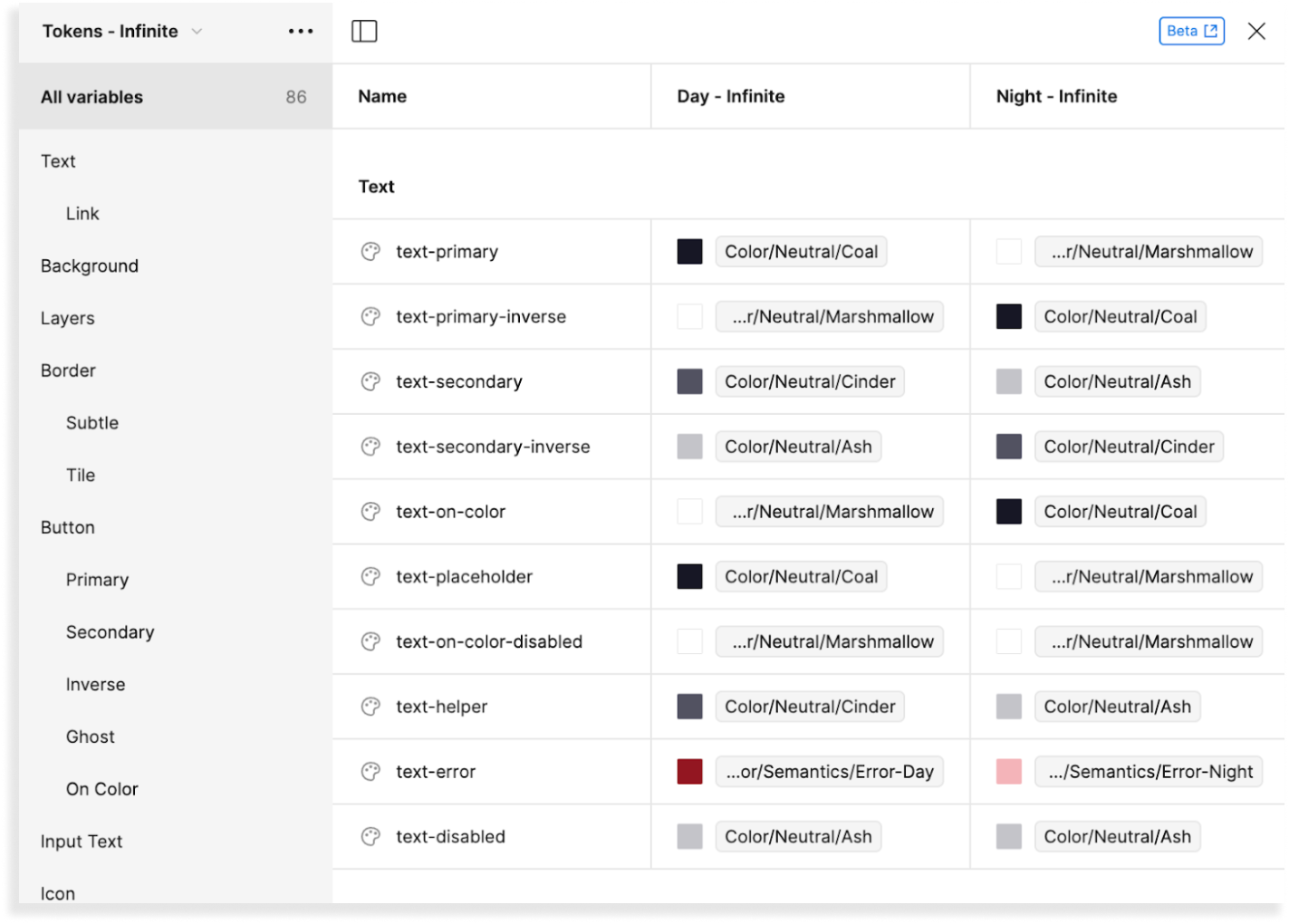
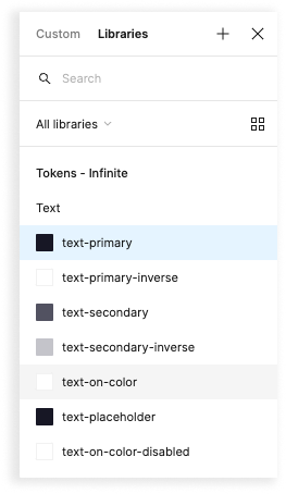
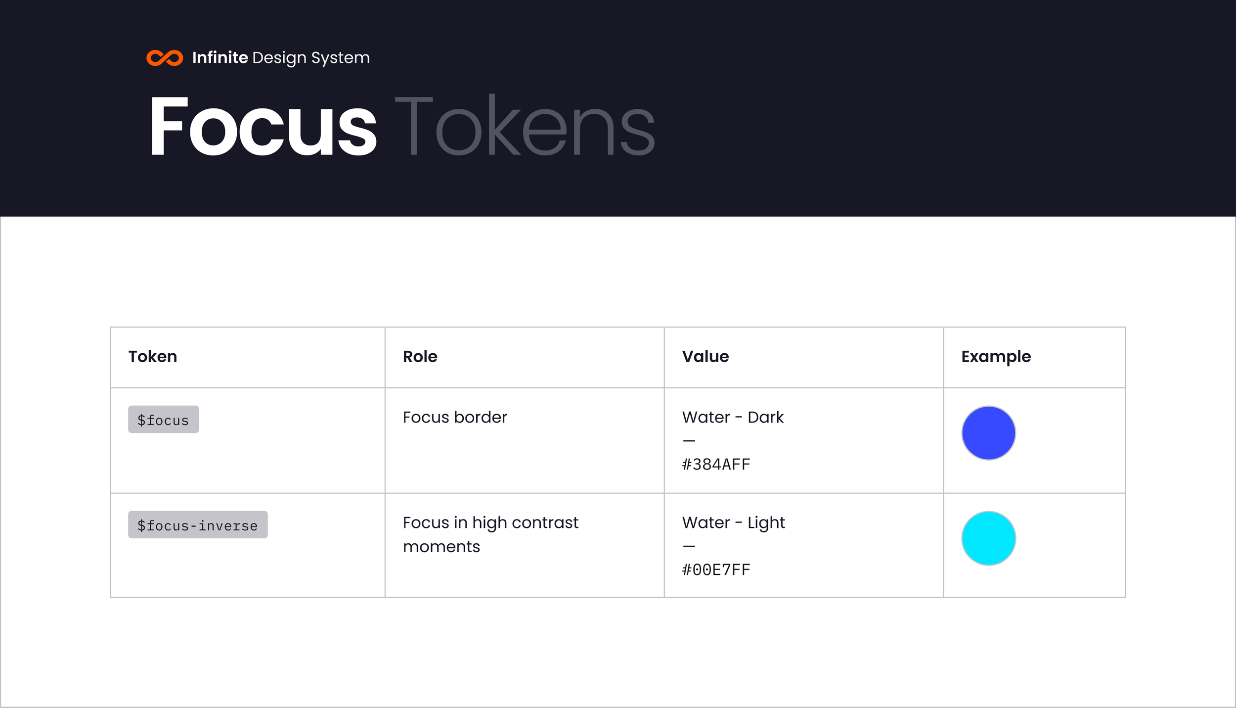
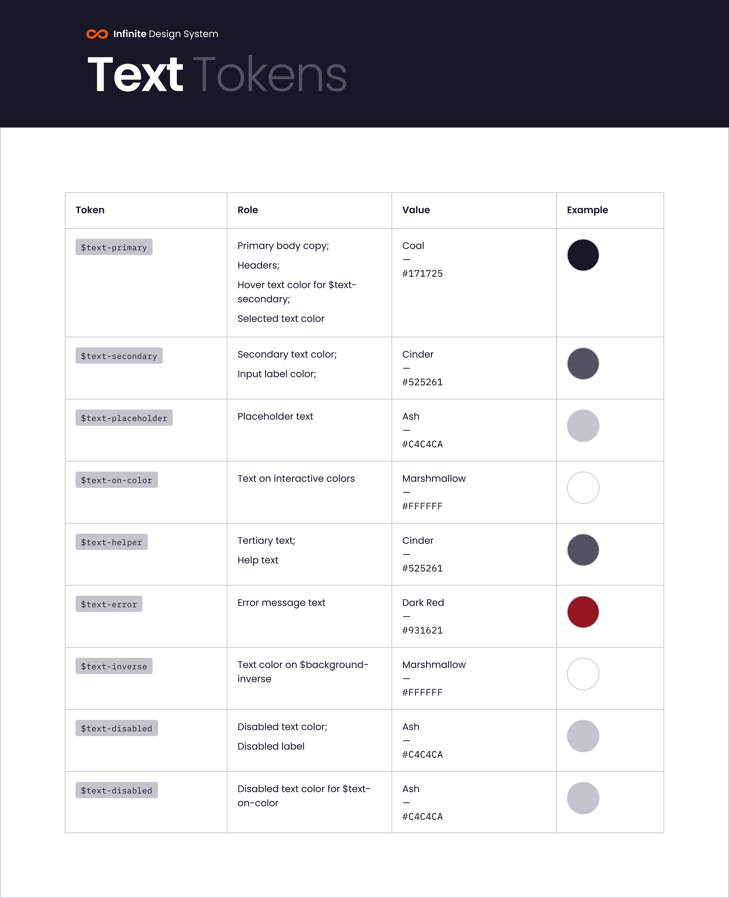
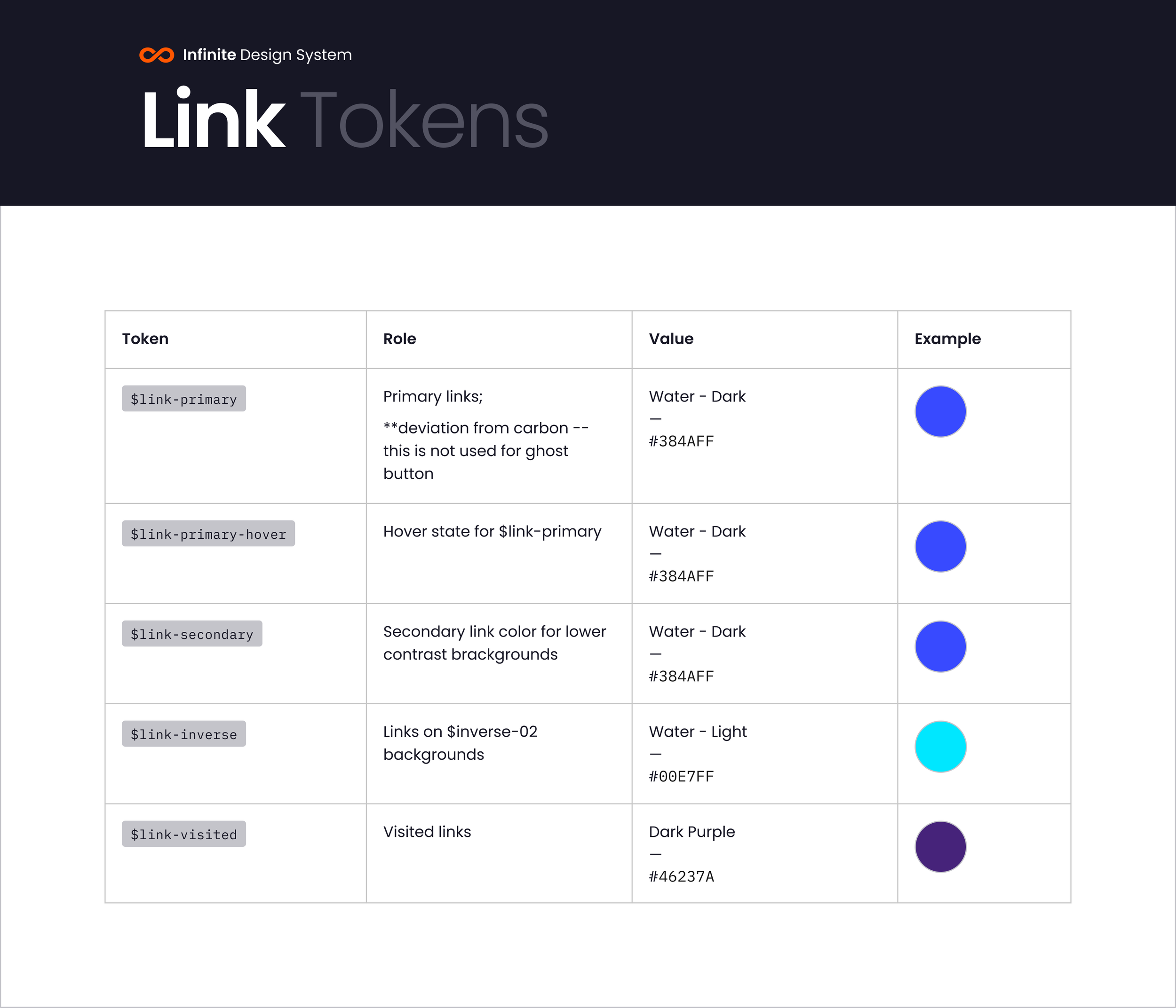
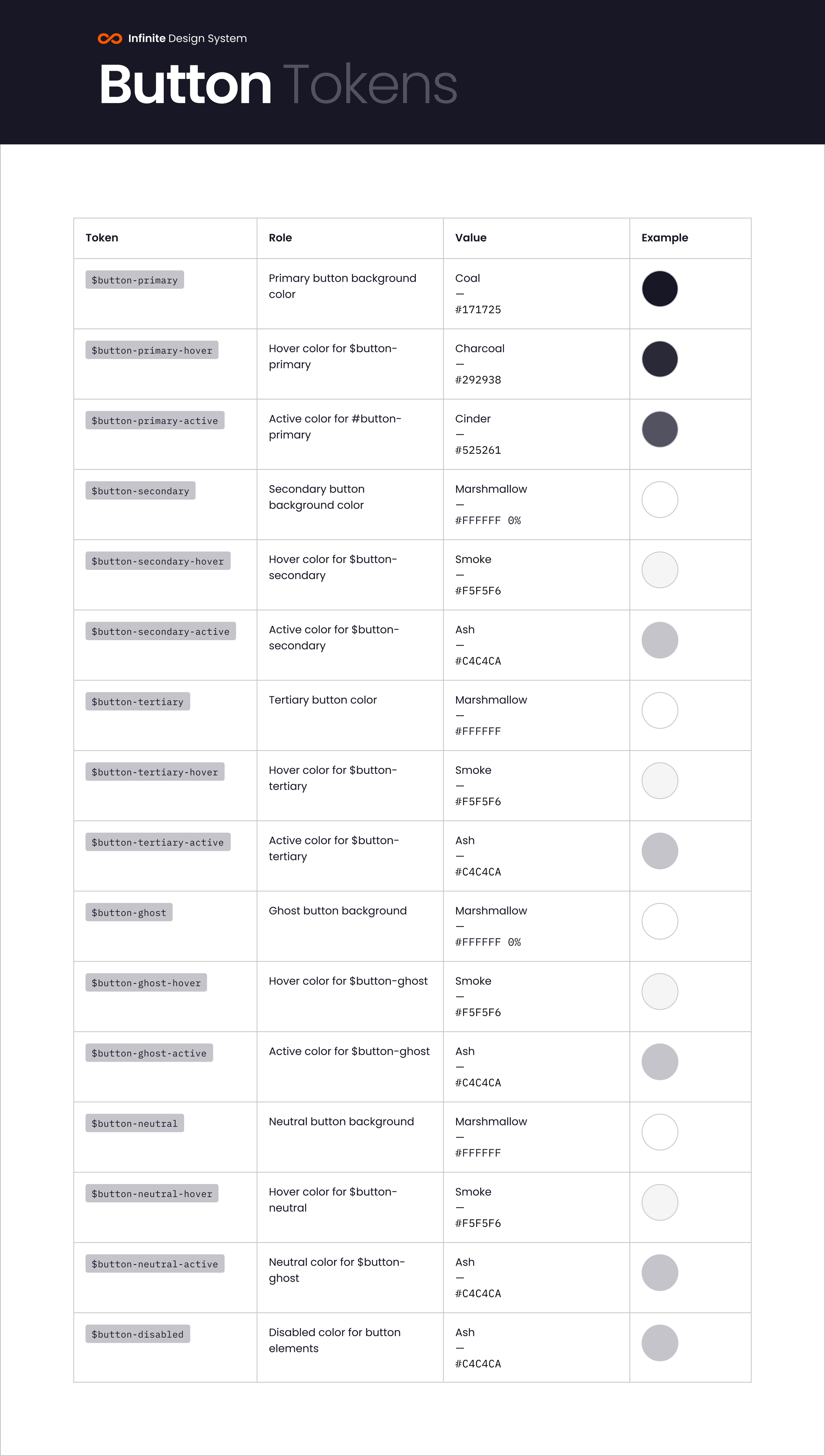
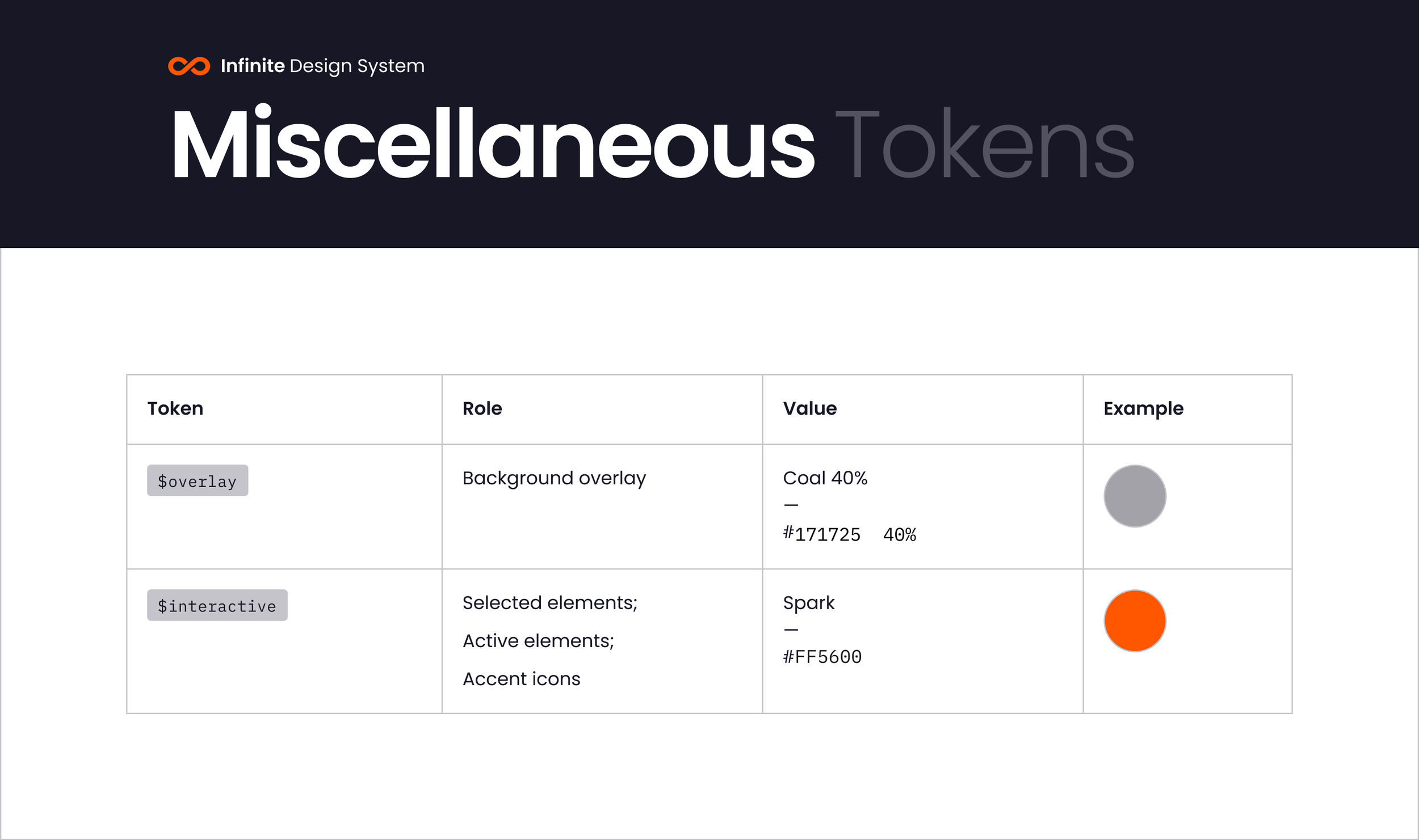
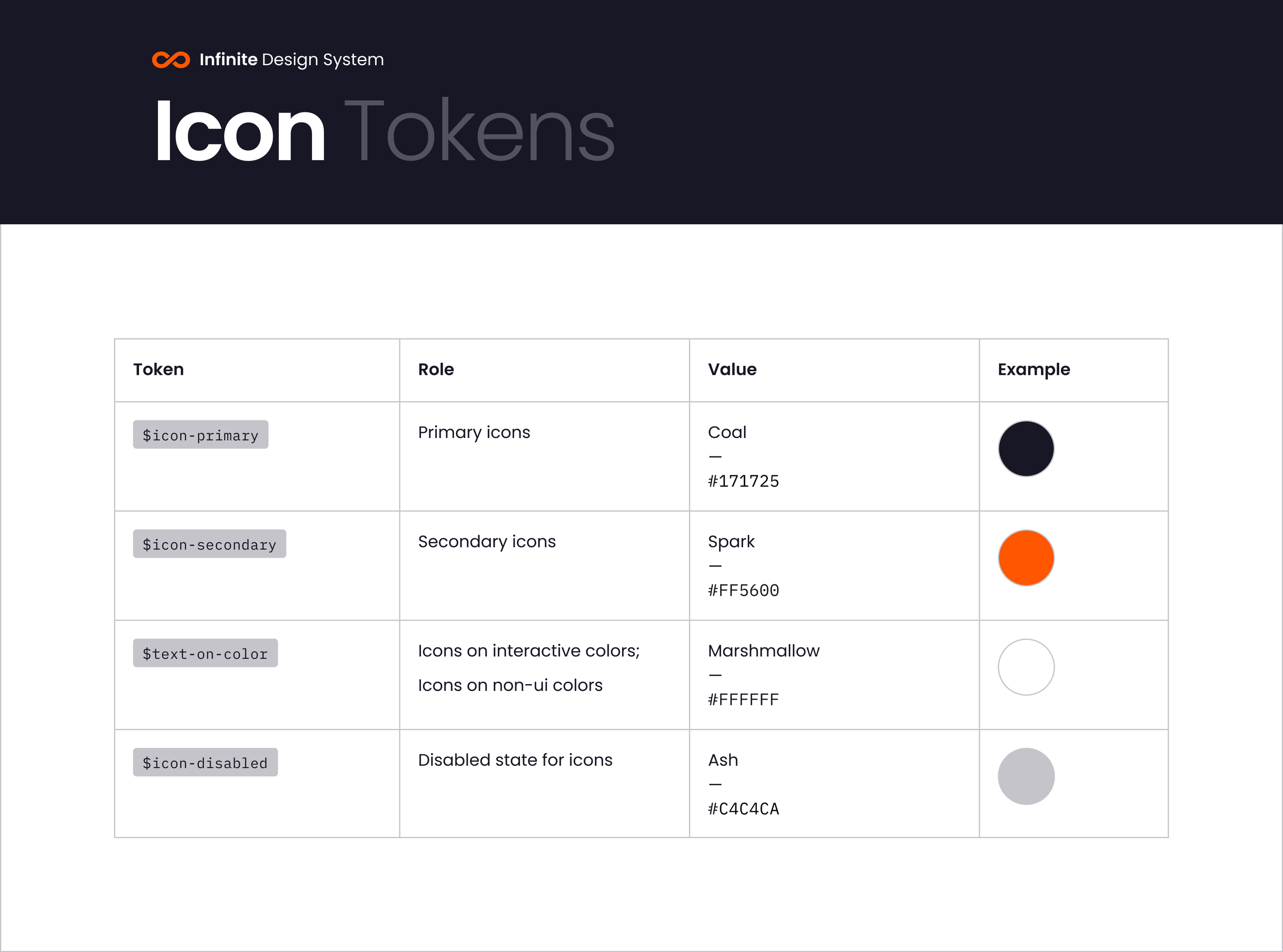
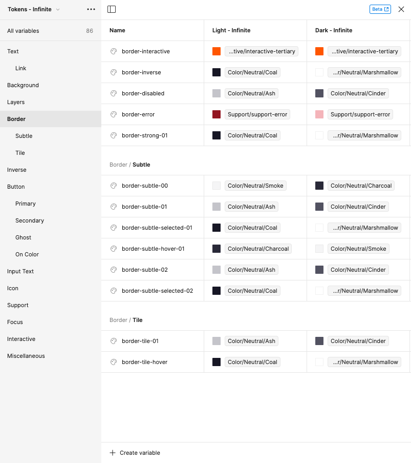
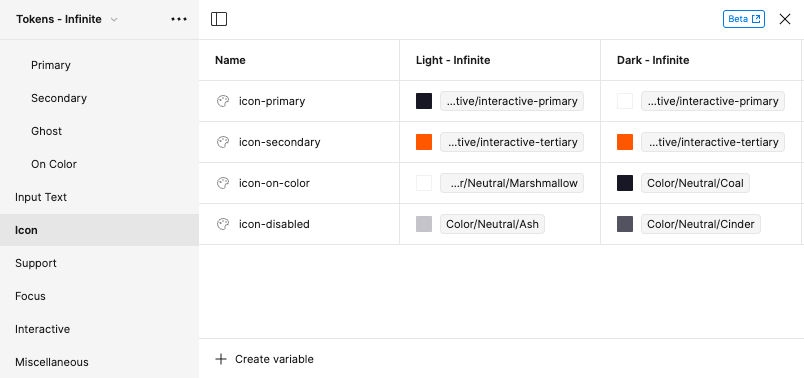
Below are some examples of how we organized and setup our Tokens inside the design system.
Tokens


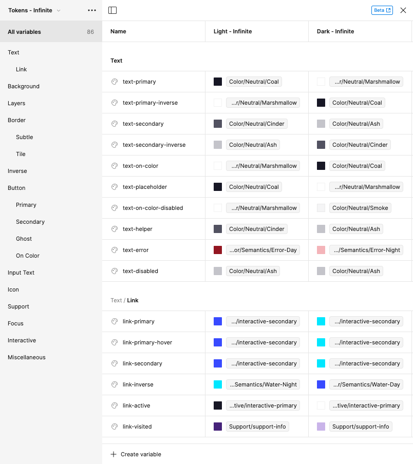
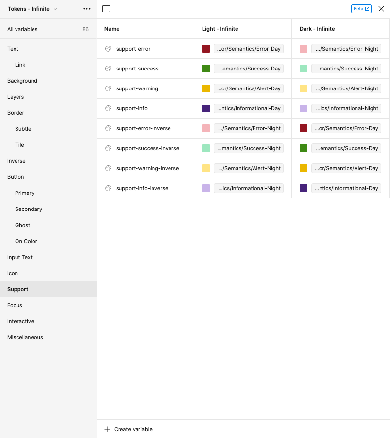
Local Variables
Local variables in Figma offer a powerful way to store and reuse values within a single file. They work like little data containers, holding various types of information you can then apply to different design elements.
When creating the local variables, it was very important for our team to be able to switch between light and dark modes. Because of that we initially created variables only included these two variables.
It's also important to mention that this is a feature currently on Beta (at the time of the writing of this article) and we handled a few hiccups as we were setting up our system. Some tokens would disappear in specific components, some colors would get mixed it up and in other moments the theme switching wouldn't work as expected, but setting up this system was not only a learning experience to "how to use it", but also to be on the lookout to not only bug fixes but updates that will bring more features that will make Local Variables even more powerful.
Below are some examples of how we setup our light and dark modes.
Creating Light & Dark Modes
In Figma, we set up local variables for light and dark modes in just a few steps. First, we created color variables for each mode, assigning appropriate primitives that were created beforehand. Then, in the same panel, we created "Light" and "Dark" modes and assigned color values for each variable in each mode. The most challenging part was to make sure all colors were correctly assigned, we also had to make sure that every single component (primary button, body text, icons, etc) were also assigned to the correct token.
It required some repetitive work to build the system, but after everything was in place, to switch between modes, we simply click the "Variable" icon at the top and choose our desired mode.
It's also possible to set up different frames with different styles, and as you copy and paste or drag and drop mockups, they will adapt automatically to the frame they are put in
The wireframe above is an example of how easy is to switch themes by using Local Variables. As we designed our pages in one mode, we got this lightning-fast mode changes for our entire design/project with a single click.
The magic happening in the frame below:
Final Remarks
Figma Tokens aren't just a feature; they represent a shift in design thinking. They prioritize consistency, efficiency, and collaboration, pushing us towards a future where design systems are dynamic, intelligent, and empower teams.
Remember, Figma Tokens are still under development, but their potential benefits for design consistency and efficiency are undeniable. By understanding the challenges and adopting a proactive approach, designers can leverage tokens to create more cohesive and adaptable design systems, even in the beta phase.
By understanding the challenges and dedicating time to learning, you can successfully unlock the power of Figma local variables and take your design process to the next level.