404 Highland Project
Project type
Web development for a 404 page
Contribution
Market Research, Wireframe creation, Coding, full implementation end-to-end.
My role
Product Designer, Software Engineer, Content Designer
Duration
1 week
Outcome
Connect customers with a better and more customized 404 page.
Increase and improve brand identity.
Timeframe
May 2021
Brand Introduction
Highland is a digital product consultancy company based in Chicago, IL.
They have gone through a rebranding process in 2020 that expanded the expressiveness of their brand.
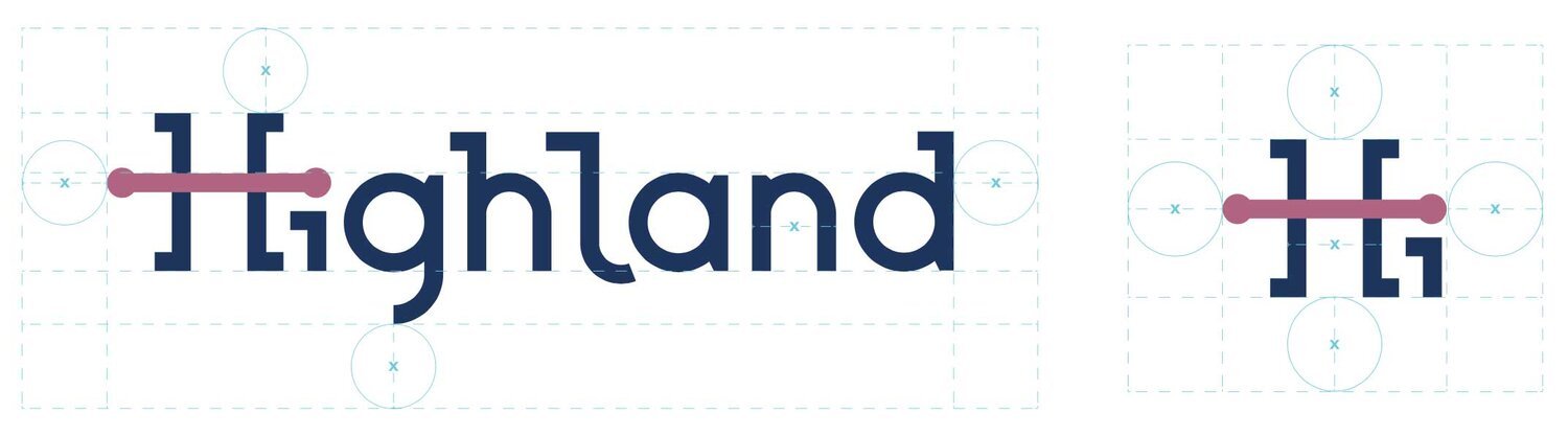
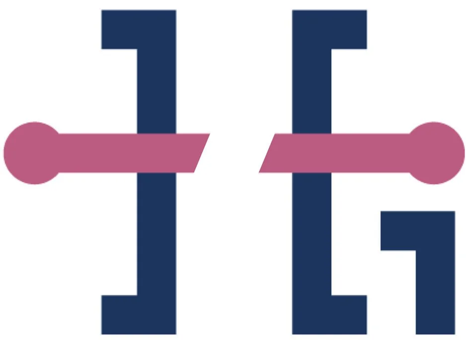
The Highland logo, for instance, represents the human approach, the H rod connects the customer with solutions that Highland can provide.
Besides the full Highland logo, there’s a friendly and smaller version that greets "Hi" to introduce the strong brand.
Brand Guidelines
The brand guidelines presented here are already in place since mid 2020, and it was heavily consulted when bringing the 404 page to life.
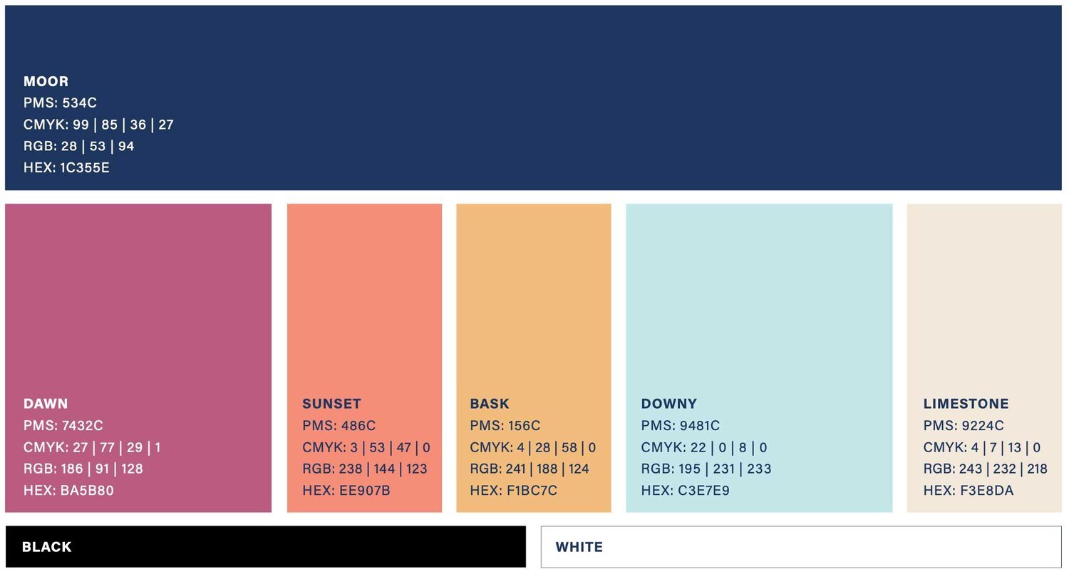
Color Palette
This color palette offers a wide range of diverse options with softer and warmer shades allowing for design flexibility. It’s inviting, approachable, and human.
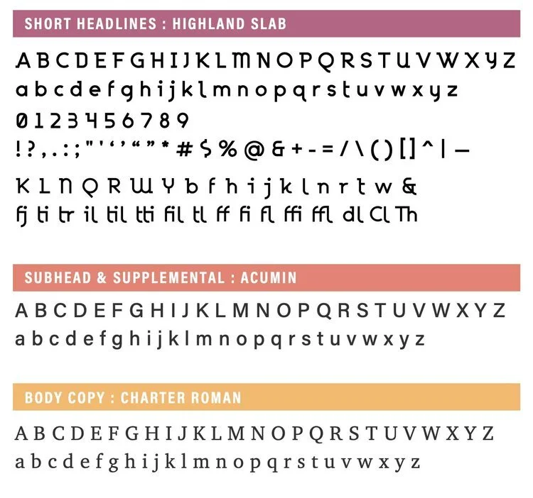
Fonts
These are the three fonts that can be used for Highland messaging. The Highland font is custom and used for short headlines. Acumin has a variety of weights, which allows for great flexibility. And Charter Roman is a classic, readable body copy font.
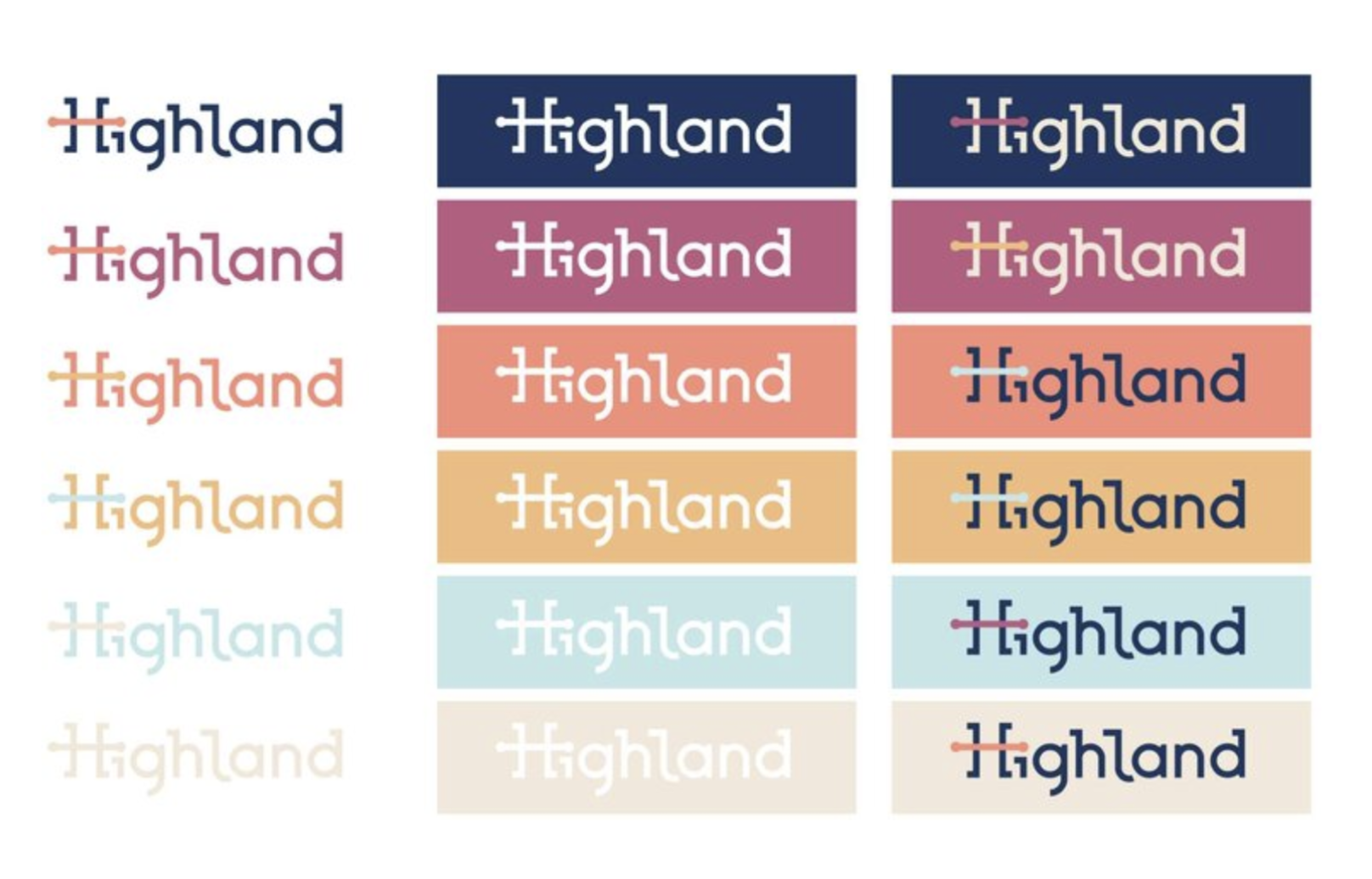
Logo
Here is a variety of alternative color options that may be used for the main logo. Most of these do not have enough contrast to meet accessibility standards though.
Reason for a 404 page
404: Page not found error is probably the most known error in the Internet. Its origins date back to the 1980’s as the standard response code generated when a user attempts to visit a broken destination.
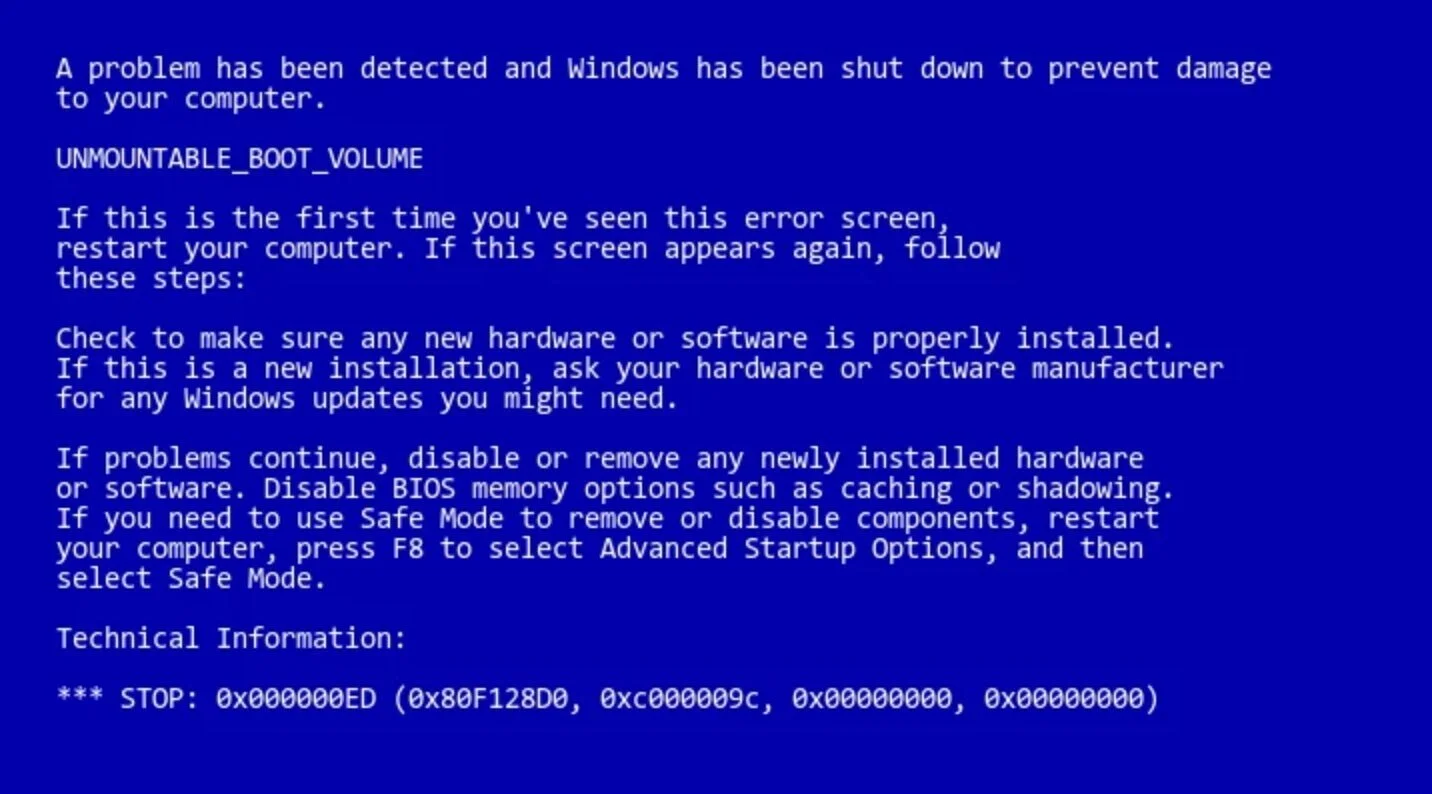
Albeit a commonly frustrating message, companies have used the error as an opportunity to express their brand and creativity while crafting their 404 error pages. The main motivation being to make the brand stronger. There aren't many expectations about an error page. Most users are used to stumble upon a blank and uninformative error page -- some might even recall the (in)famous blue screen of death.
Inspiration
Creative error pages have become popular among companies that want to reinforce their values and push the guidelines for how brands can be represented -- usually with a naive and humorous tone. For users, a chuckle and a handy “go back” link are usually offered as a light at the end of the tunnel.
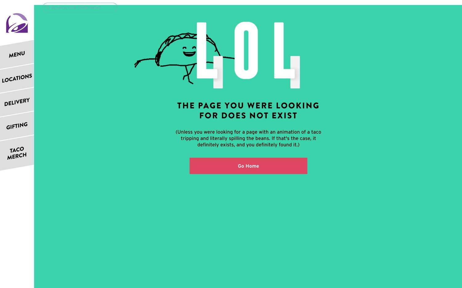
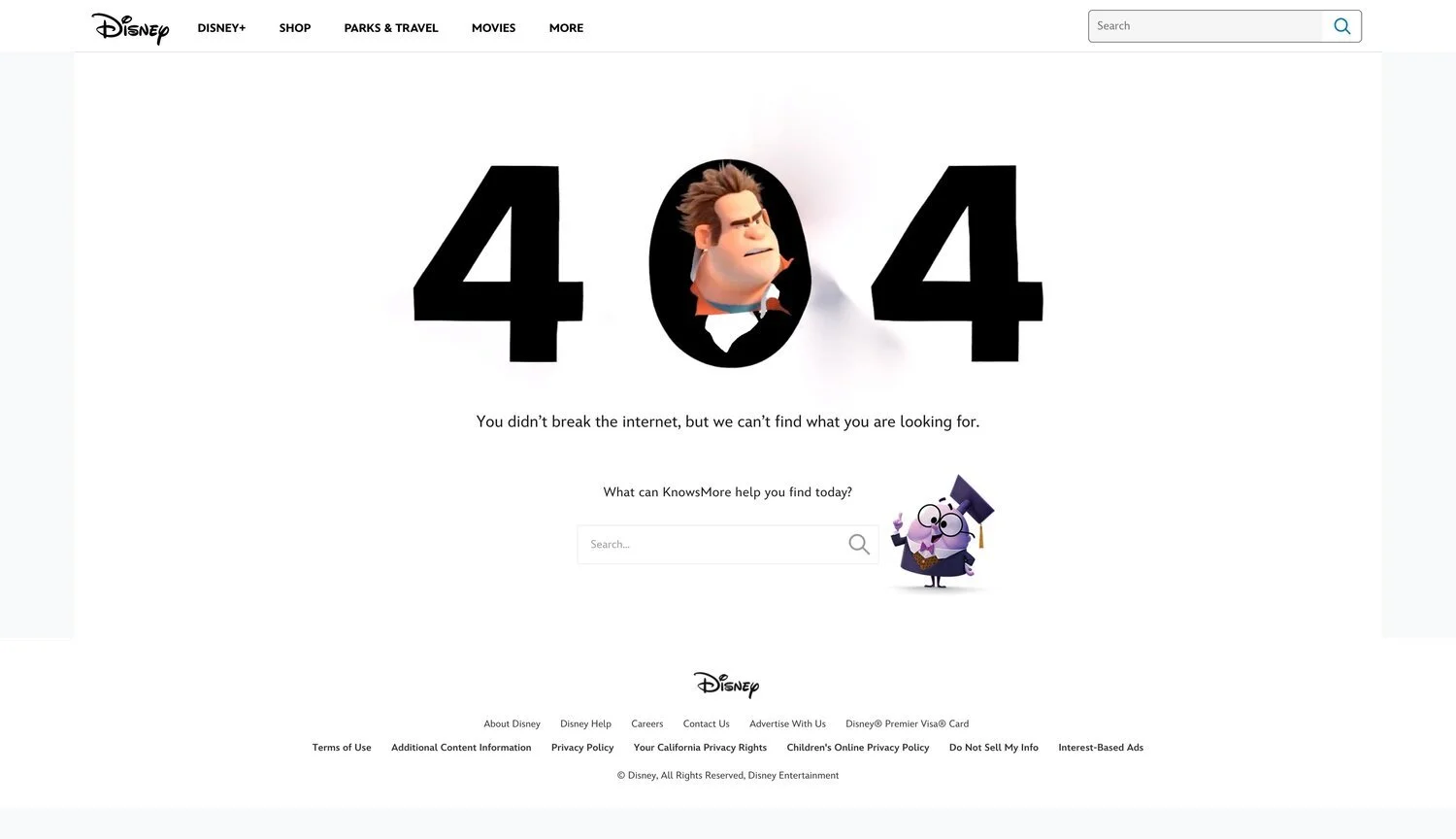
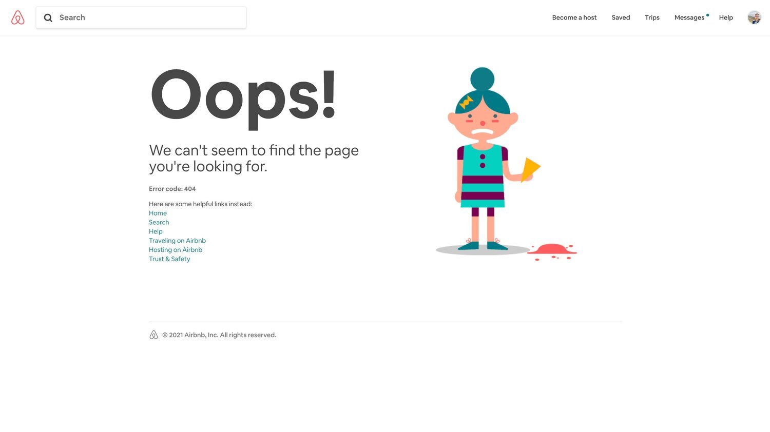
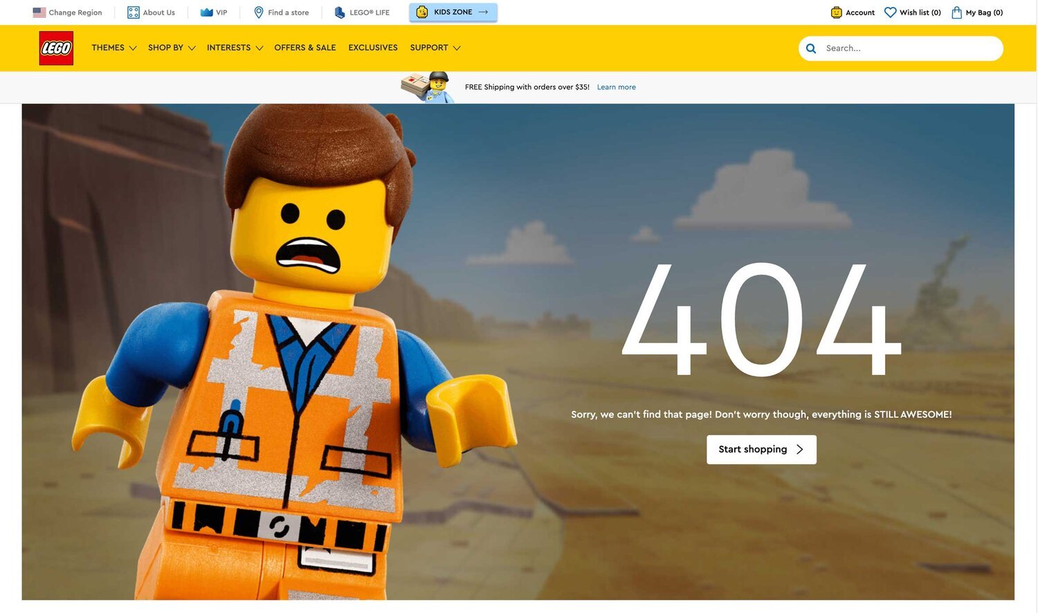
Some fun examples of 404 error pages we have:
Flexing the brand
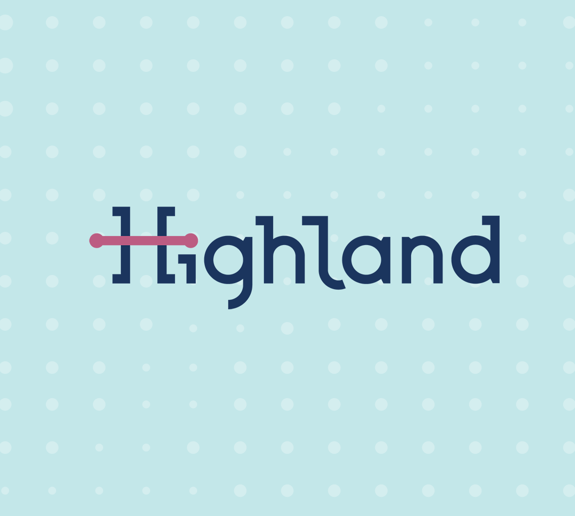
Back to Highland’s H rod is one of the strongest representations of the brand’s identity, I thought it would be fun to flex the brand just enough to balance between the brand recognition and the unfortunate case of a broken / disconnected link.
The interrupted connection represented on the logo and the accompanying "Hey! Something went wrong" message gives a direct feedback about what happened to castaways.
As a handy lifesaver, a single button can reconnect visitors back to the website and the H rod connection will be reestablished.
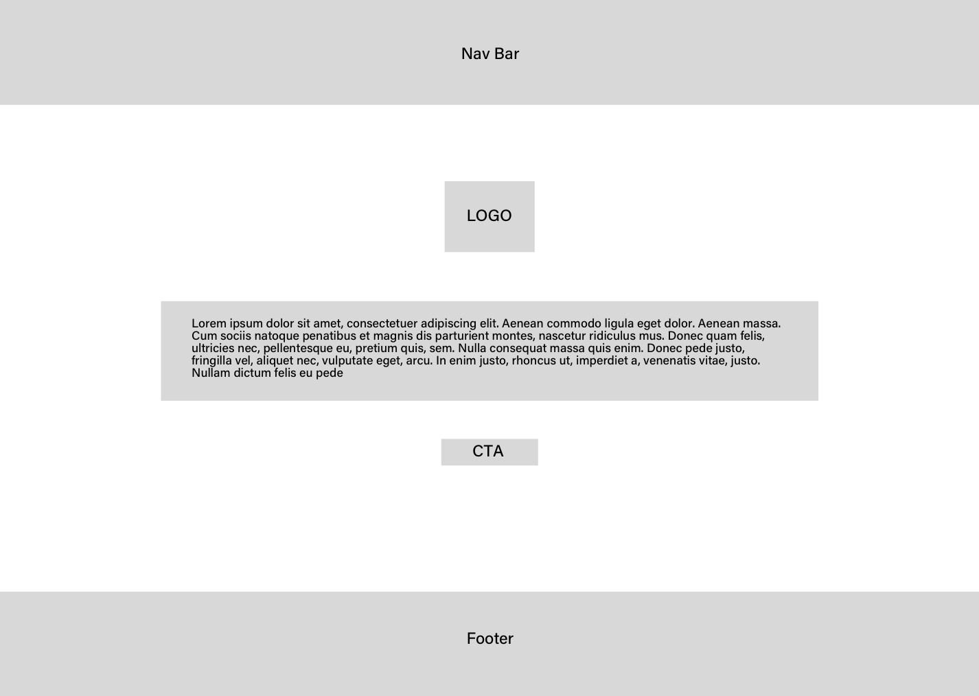
Low fidelity mockup
The 404 page will be consisted in: 1. Nav Bar, 2. Deviated logo, 3. Message for page not found, 4. CTA, 5. Footer
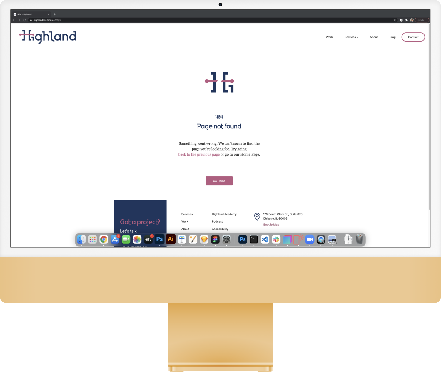
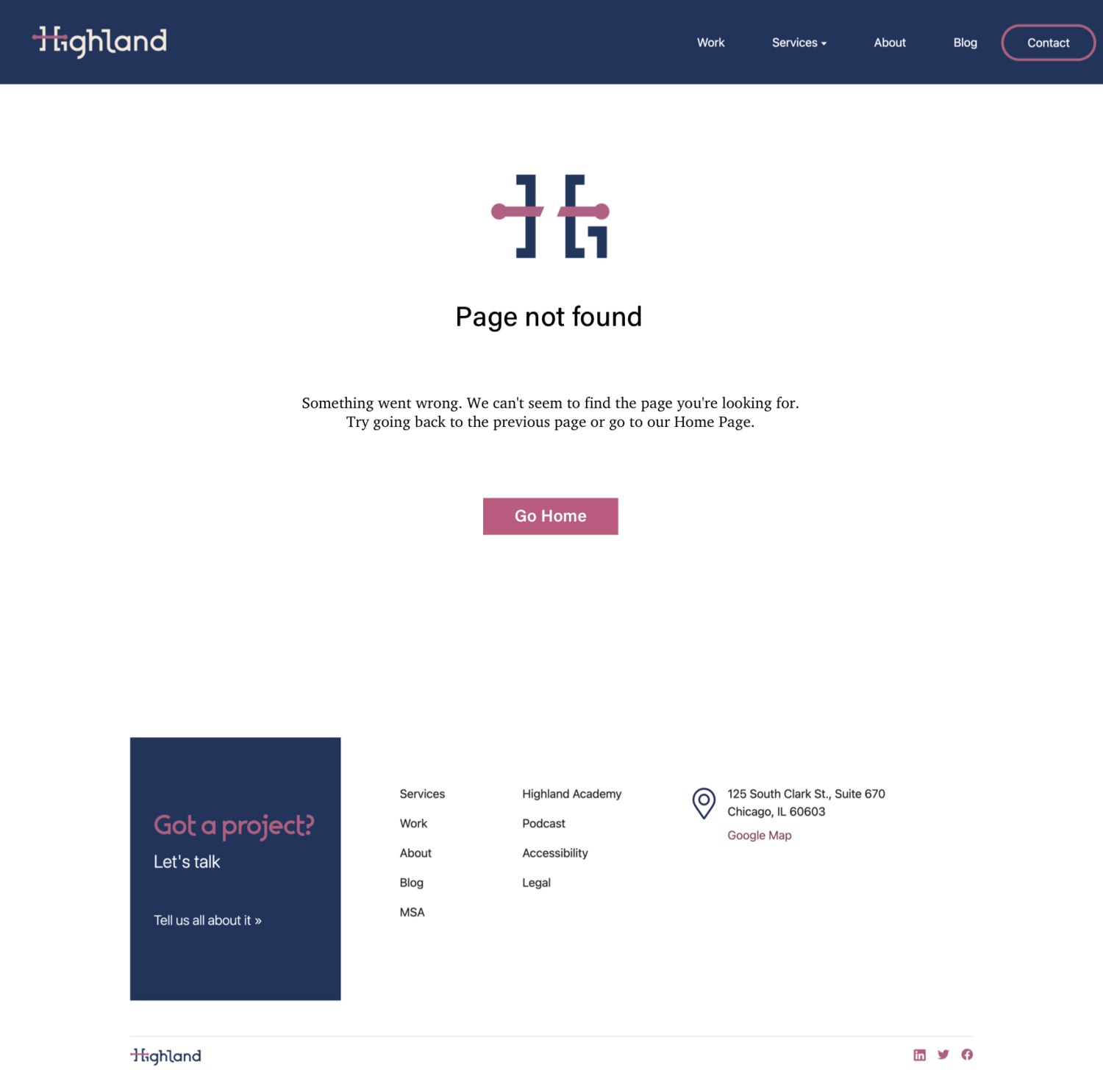
High fidelity mockup
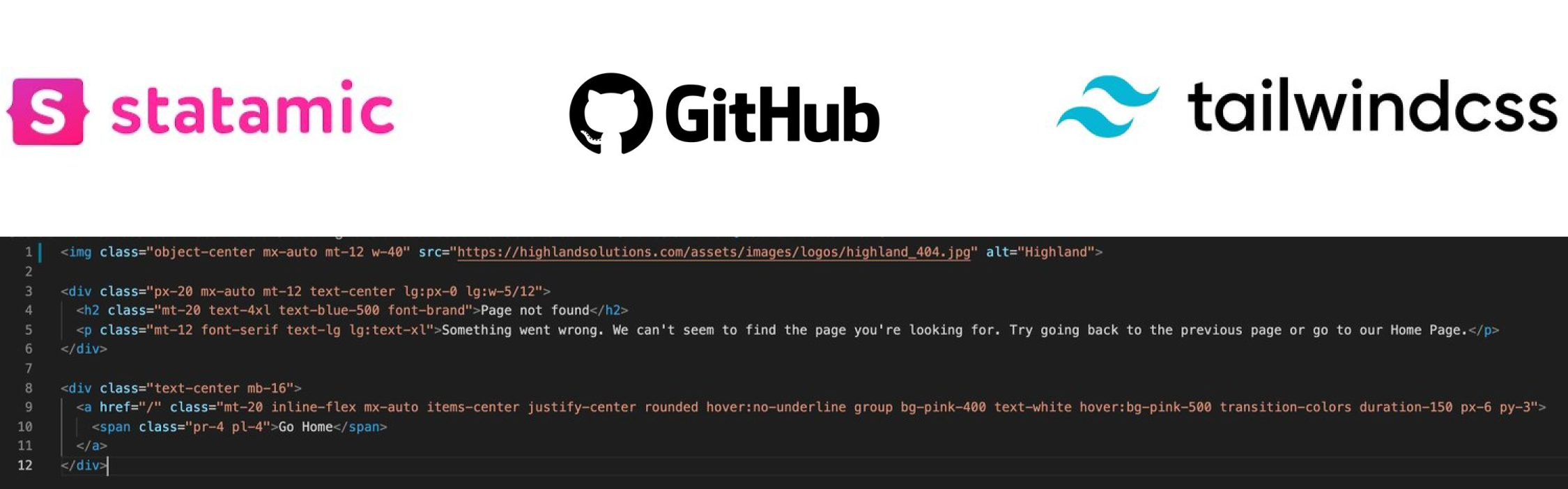
Implementation
Statamic is the CMS platform used by Highland. With that said, the page was coded using Tailwind CSS and deployed on Github.